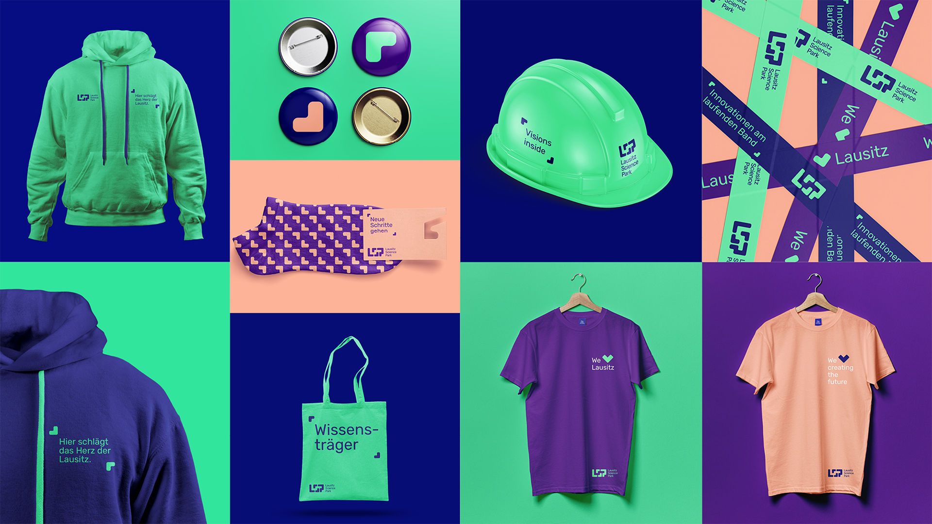
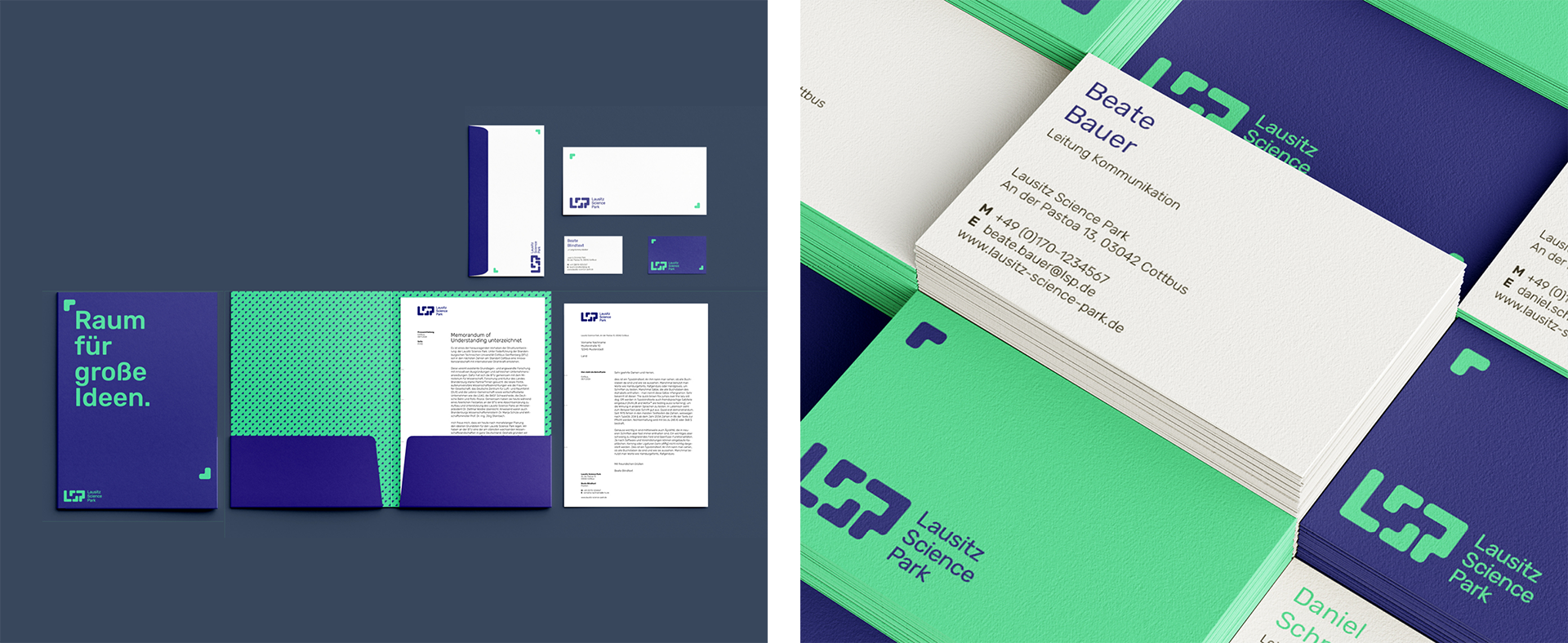
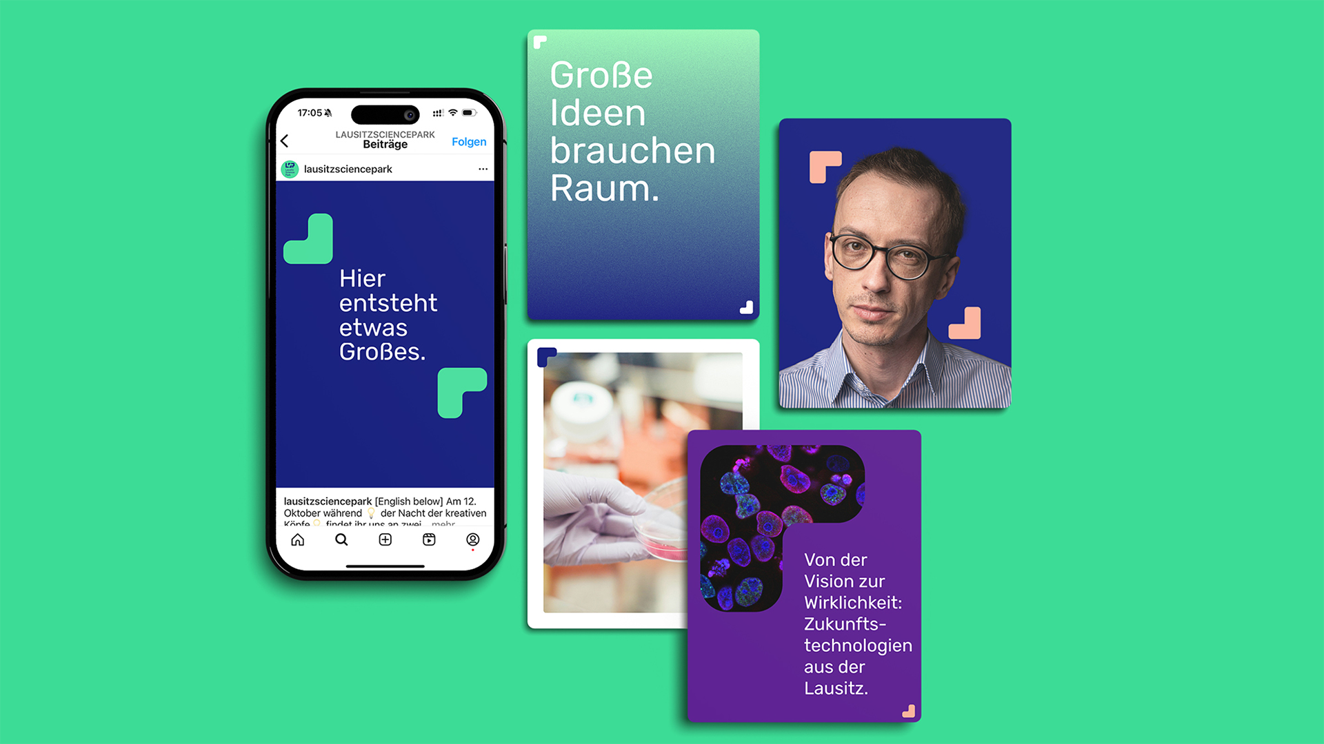
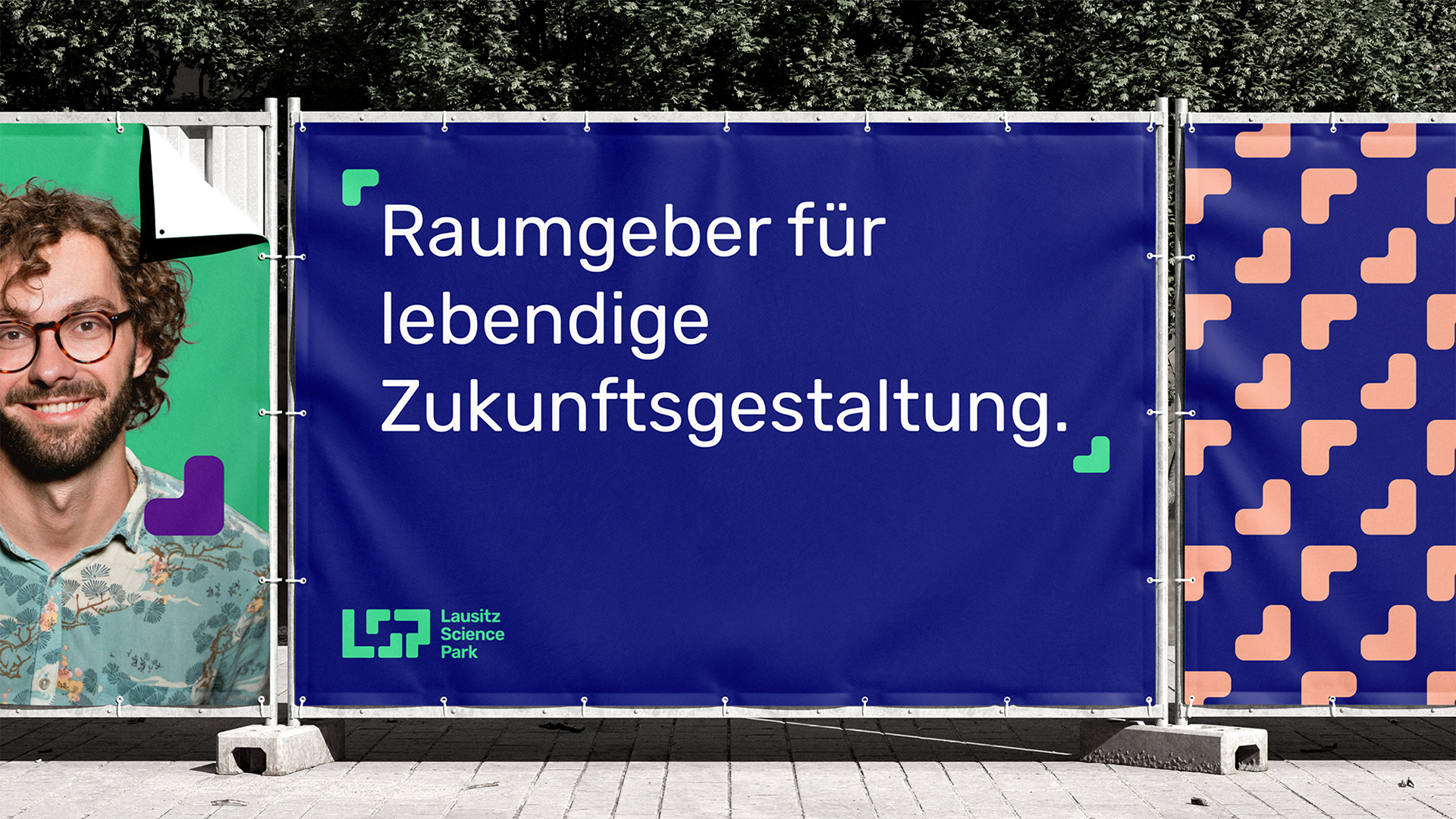
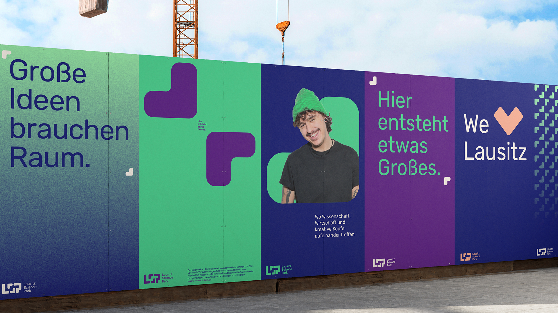
The LSP unites forward-looking sectors under one roof and acts as a hub for research, business and industry. The brand identity developed by wirDesign is based on the guiding principle "Space provider for vibrant future design" and reflects the aspiration to create a place of new beginnings and visions.
More visibility for Lusatia
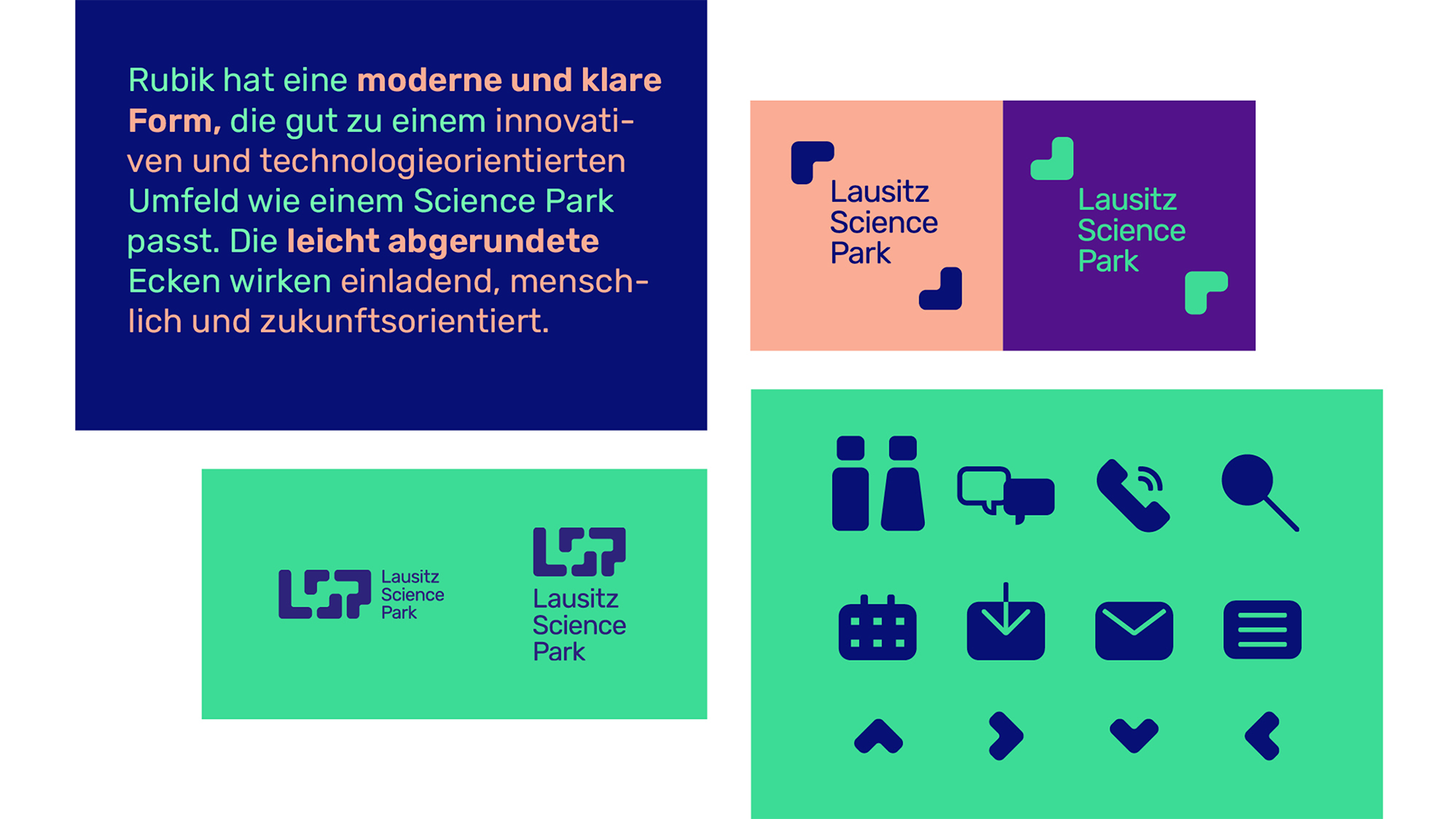
As part of the project, comprehensive research and brand workshops were conducted together with LSP stakeholders from science, business and administration in order to develop a clear positioning, tonality and visual identity. The abstracted "S" from the logo serves as the central design element and creates a flexible framework for content. Bright colors visualize the international appeal and give Cottbus and the Lusatia region greater visibility. The Rubik as the corporate typeface stands for clarity and approachability.
"The new brand identity conveys new beginnings, openness and innovative spirit. It is scalable, system-compatible and strengthens the LSP's self-image as an interdisciplinary innovation ecosystem. wirDesign has created an image that inspires - both regionally and internationally. The new brand identity makes the LSP visible and tangible as a powerful driver of structural change," says BTU project team member Julia Raunick, responsible for communications and press at the LSP.